Why Colors Look Weird Under Some Lights: A Simple Guide to CRI
Have you ever bought a shirt at the store thinking it was a rich, deep blue, only to step outside into the sunlight and realize it’s actually dark purple? Or maybe you’ve noticed that the food in a restaurant looks fresh and delicious, but under your kitchen light, it looks kind of gray and unappealing.
You aren’t losing your mind and your eyes are working just fine. The real culprit is the light bulb you’re using.
To understand why this happens, we need to talk about a hidden feature on the back of every light bulb box: CRI, or Color Rendering Index
(Houser et al., 2015).
- What on Earth is CRI?
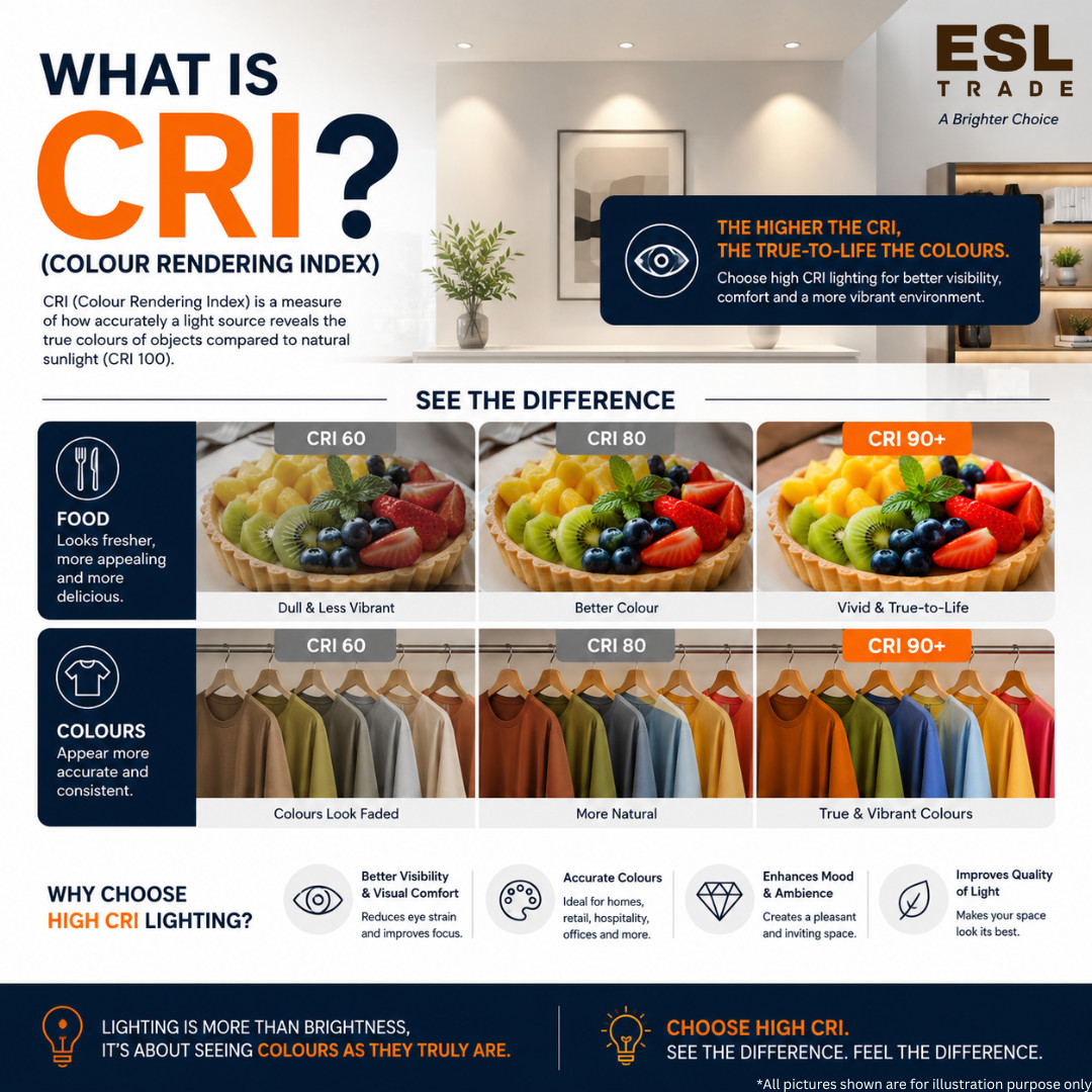
Put simply, the Color Rendering Index (CRI) is a score from 0 to 100 that tells you how “real” or accurate colors look under an artificial light bulb compared to natural sunlight
(Haldeman et al., 2008).
Think of sunlight as the perfect lighting score of 100. It contains every color of the rainbow. When sunlight hits a red apple, the apple reflects that red light perfectly to your eyes.
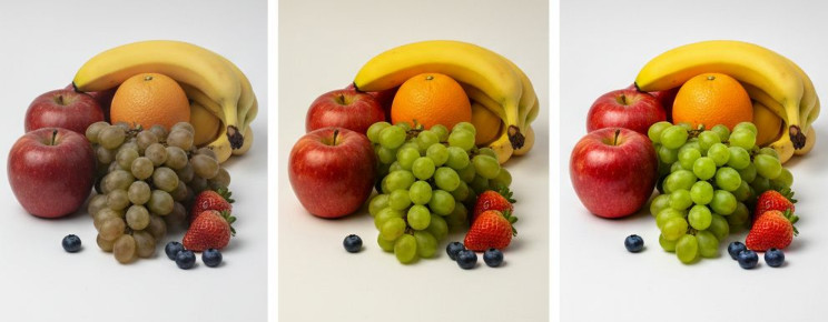
Artificial lights, like LEDs or old fluorescent tubes, are different. They have to fake white light by mixing different colors together. If a light bulb lacks the right mix, it won’t reveal the true colors of the objects around it. A high CRI bulb brings out the real colors; a low CRI bulb makes things look washed out, distorted, or completely wrong
(Houser et al., 2015).
- The CRI Scorecard: What Do the Numbers Mean?
When you shop for light bulbs, you will usually see a CRI number listed under the technical specifications. Here is a quick cheat sheet to know what you are getting
(Antonino Daviu, 0):
- CRI 90 and Above (Excellent): This is the gold standard. Colors look vibrant, accurate, and completely natural. It is perfect for places where color matters most, like art studios, clothing stores, and your bathroom or kitchen mirror.
- CRI 80 to 89 (Good): This is the standard for most homes and offices. It is totally fine for everyday living spaces like hallways, bedrooms, or living rooms where you don’t need absolute color precision but still want things to look pleasant.
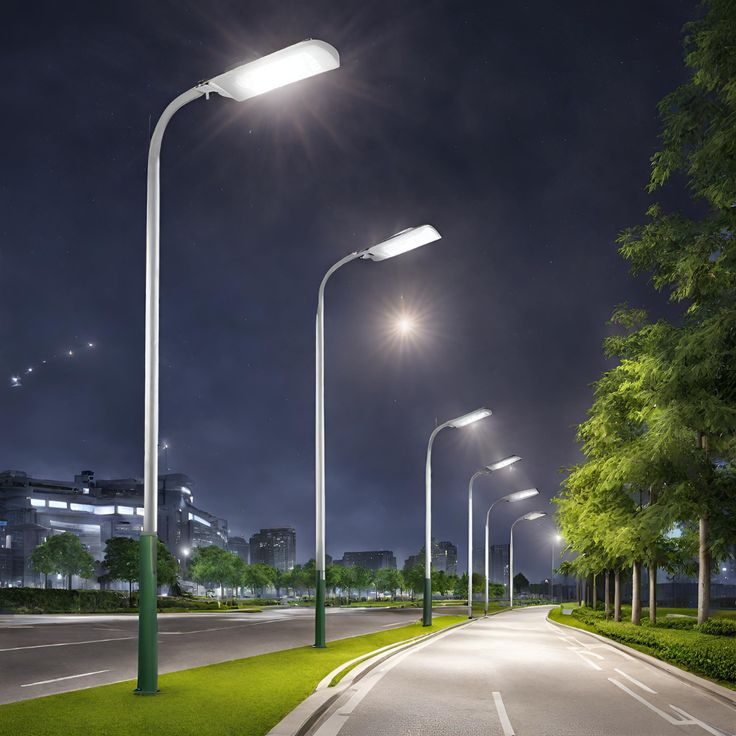
- CRI Below 80 (Poor): Avoid this for indoor living. It makes skin tones look pale or sickly, and turns vibrant home decor into a dull, muddy version of itself. You usually find this in outdoor streetlights or basic parking garages.
The Secret “R9” Value (Why It Matters for Your Home)
Here is a quick industry secret: the standard CRI score you see on a box is actually an average of only eight pastel colors (Royer, 2019). Because it only tests pale shades, a bulb can cheat the system. It can score a decent CRI of 80, but still be absolutely terrible at showing strong, vibrant colors especially Red.
- In the lighting world, the vivid red test sample is called R9 (Oh, 0).
If a bulb has a low R9 score, fruits will look old, wood floors will look dull, and human skin will look washed out because our skin tones rely heavily on red undertones. If you want your home to look warm, alive, and inviting, always look for bulbs that explicitly mention a high R9 value alongside a high overall CRI
(Soltic & Chalmers, 2019).
- How to Choose the Right Bulb for Your Space
You don’t need museum-grade lighting in every single corner of your house, but matching the right CRI to the right room makes a massive difference:
| Room / Application | Recommended CRI | Why It Matters |
| Kitchen & Dining | 90+ | Makes food look fresh, appetizing, and brightly colored. |
| Bathroom Vanity | 90+ | Helps you see your true skin tone for makeup application or shaving. |
| Living Room & Bedrooms | 80–90 | Creates a comfortable, warm environment for relaxing. |
| Garage & Outdoor Security | 70–80 | Color accuracy matters less here; energy efficiency is the main goal. |
Summary: Bring Your Home to Life
The next time you replace a burnt-out light bulb, don’t just look at the price or the brightness (lumens). Take a quick glance at the CRI rating. Investing in a bulb with a CRI of 90 or higher is one of the easiest, cheapest ways to instantly upgrade your home. It makes your furniture pop, your food look better, and your space feel truly alive.
References
- Antonino Daviu, J. (0). Basic lighting quantities. RiuNet – UPV, 1–8.
- Haldeman, B., Porter, W. A., & Ruppert, K. C. (2008). Energy efficient homes: Introduction to LED lighting. EDIS, 2008. https://doi.org/10.32473/edis-fy1049-2008
- Houser, K., Mossman, M., Smet, K., & Whitehead, L. (2015). Tutorial: Color rendering and its applications in lighting. LEUKOS, 12(1), 7–26. https://doi.org/10.1080/15502724.2014.989802Cited by: 136
- Oh, S. (0). A control method for optimizing the spectral ratio characteristics of LED lighting to provide color rendering performance comparable to natural light. PMC.
- Royer, M. (2019). Analysis of color rendition specification criteria. Light-Emitting Devices, Materials, and Applications, 55. https://doi.org/10.1117/12.2507283Cited by: 13
- Soltic, S., & Chalmers, A. (2019). Optimization of LED lighting for clinical settings. Journal of Healthcare Engineering, 2019, 1–8. https://doi.org/10.1155/2019/5016013Cited by: 28